Posts

Blog #13

Image
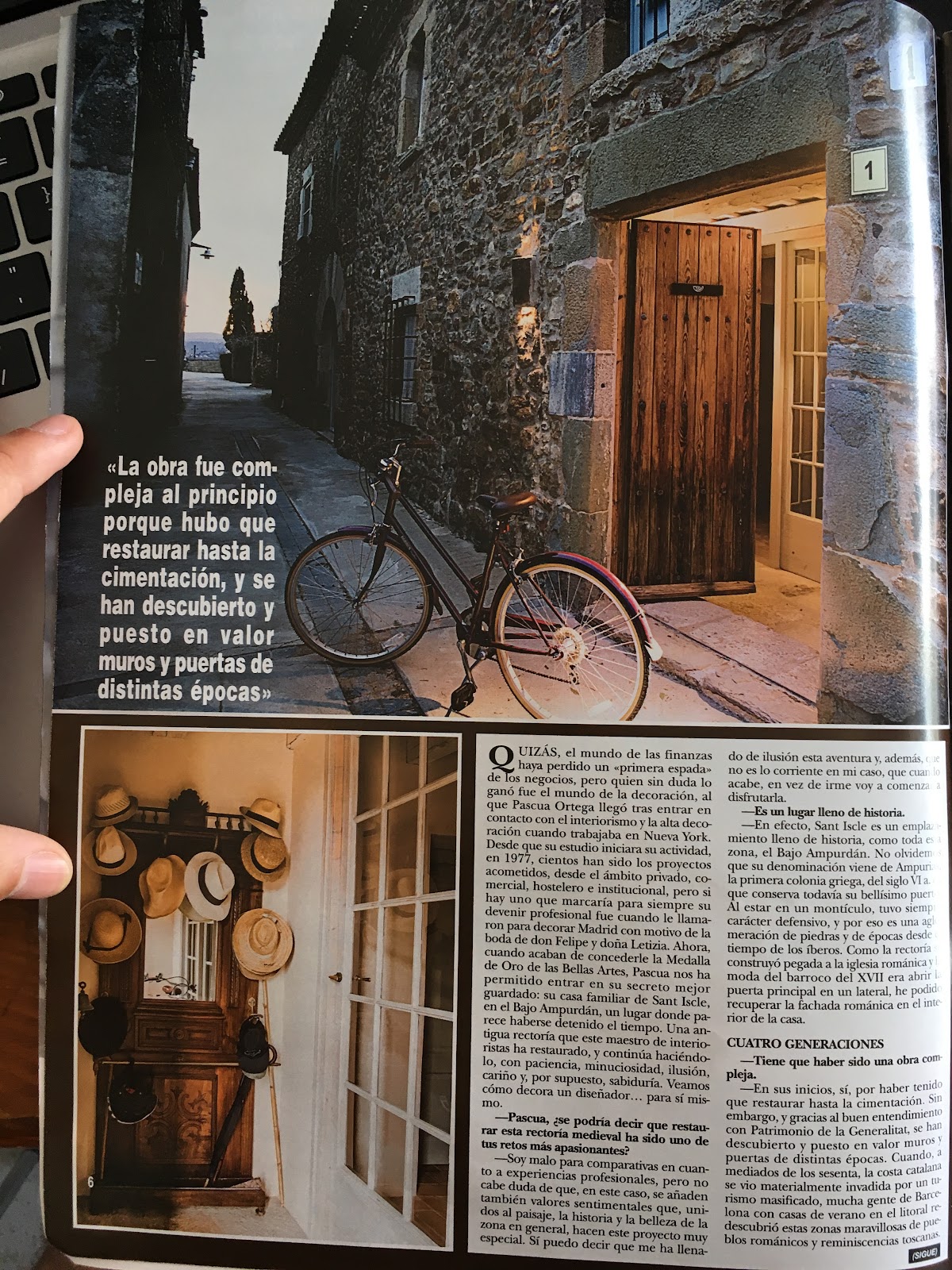
Hi blog I am still in Colorado while skiing yesterday I fell and hurt my wrist, neck, and shoulder. Because of this fall I am taking a day off which is today. Since I stayed in my apartment today I decided to get some progress done on my project. Today I was looking how to structure text in a magazine. I was using my moms "HOLA!" magazine. Even tho it is not a travel magazine I am assuming that all magazines have a similar structure on how text is placed. I will be attaching an image on how these magazines are structured so you can see what I looked at.
Blog #12

Hey blog I managed to find some time to work on the magazine. I am researching colors that I will be using within the magazine. I have to show my partners the colors and why we should use them. The colors should be used in every issue that we use in order to let the audience recognize our magazines by seeing our font and colors. Here is a link I found describing the color yellow which is what the main font color of our magazine is going to be. http://www.cabinetmagazine.org/issues/21/thompson.php In this article it talks about how yellow can highlight things in a way where it can convey different meanings. These meanings all depend on the reader. Therefore I want to have the color yellow as out font color for the magazine header.

Blog #11

Hey blog I am falling behind on my project. My family decided to take a week trip to Colorado to go skiing. I don't know how much progress will be made through out this week because I will be out most of the day. I'll try and do some work. Right now I am working on the airport Wifi that I gained access too for half an hour. While away I will be documenting some of the stuff I need to do ASAP for the magazine. I'll be putting up reminders so that I can think about the project through our the day. See you in the next blog!

Blog #10

Hey blog today I worked on Canva begging to get my magazine started. I feel like I should have started before now that its coming closer to the end of the year for me and more events keep on coming up. I started by trying to pick all the pictures I'll be using in it. I started placing them on the magazine to see what it would look like and to see which ones I liked. I am currently clueless to what I will be actually writing inside of the magazine. I am going to create a separate google docs and I will jot down random ideas/topics I get that I can include or write about in the magazine.

Blog #9

Image
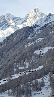
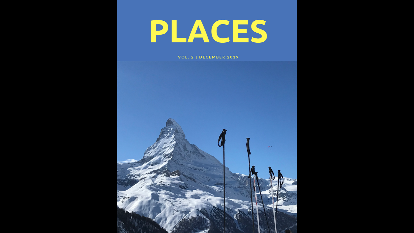
Hi blog I haven’t uploaded in a few days, today I decided what location I want to use for my magazine issue. I will be using Zermatt, Switzerland as my main location in the magazine. I want to make it about the t he locations you can visit while you are there and also I want to talk about the ski resort that they have in Zermatt which is in the Swiss alps. I have a lot of information to write about and I have several pictures I can use to show off this location. An idea I had was that since I am talking about a ski resort; In a small section on maybe the double page spread I can talk about other ski resorts around the world that attract people from all over the world such as Bariloche in Argentina, Vail and Aspen  in Colorado, Park City in Utah… The list goes on and on with all these ski resorts. I have been using Canva to try and create a front page and I created this. This is only a idea I had while messing with Canva. I like the look of this cover and this is...

Blog #8

Image
This is a very basic sketch of what I want my front cover and two page spread to look like. I am still unaware of what my two page spread will contain, but I need to figure that out soon. I spoke with Gabriel and Alejandro about the magazines, because we still haven't decided on what title we want to use, also we don’t know what font and font color we will use on the cover. I think using blue and yellow as the main colors of the magazine could be nice because it will be easy to distinguish for the audience and those colors appeal to people. I will have to conduct some research on what fonts we like. This is something I haven't really paid much attention too because I haven't really started to put my magazine together. I feel like once I start making the magazine I will easily be able to decide on what font I will use.

Blog #7

Image
Today in class we had a feedback session with other classmates who aren't part of our group. I showed them what I had done of my blog so far. They gave me some tips, pointers, and advice on what to do with the magazine. I spoke to them about the locations I had and I asked them which places they thought were best. They told me that Venice and Paris were probably the two best places since they are easy to identify in pictures, and it can peak a lot of peoples interest about the places they can go there that they don't know about since it is a travel magazine. The problem with those places for me is that I don't think I have enough pictures to use to create the magazine. Instead I showed them the pictures of Zermat that I had and they instantly told me to go with that. I'll attach some of the pictures I took to the end of this post so you all can see. After the discussion I met up with my partners and we talked about the fonts, colors, and titles that we should use and de...